Kellogg’s
+ Concept
+ Design Direction
+ Art Direction
+ Design
+ Copywriting
+ Activation
Agency: Landor
︎ Gold - 2020 Transform Awards Europe for Best Visual Identity: FMCG
︎ Silver - 2020 Transform Awards Europe for Best Use of Packaging
︎ Winner - 2019 Drum Design Award for Packaging Design: Graphic
︎ Silver - 2019 FAB Award for Brand Redesign
︎ Silver - 2019 FAB Award for Packaging Design: Effectiveness
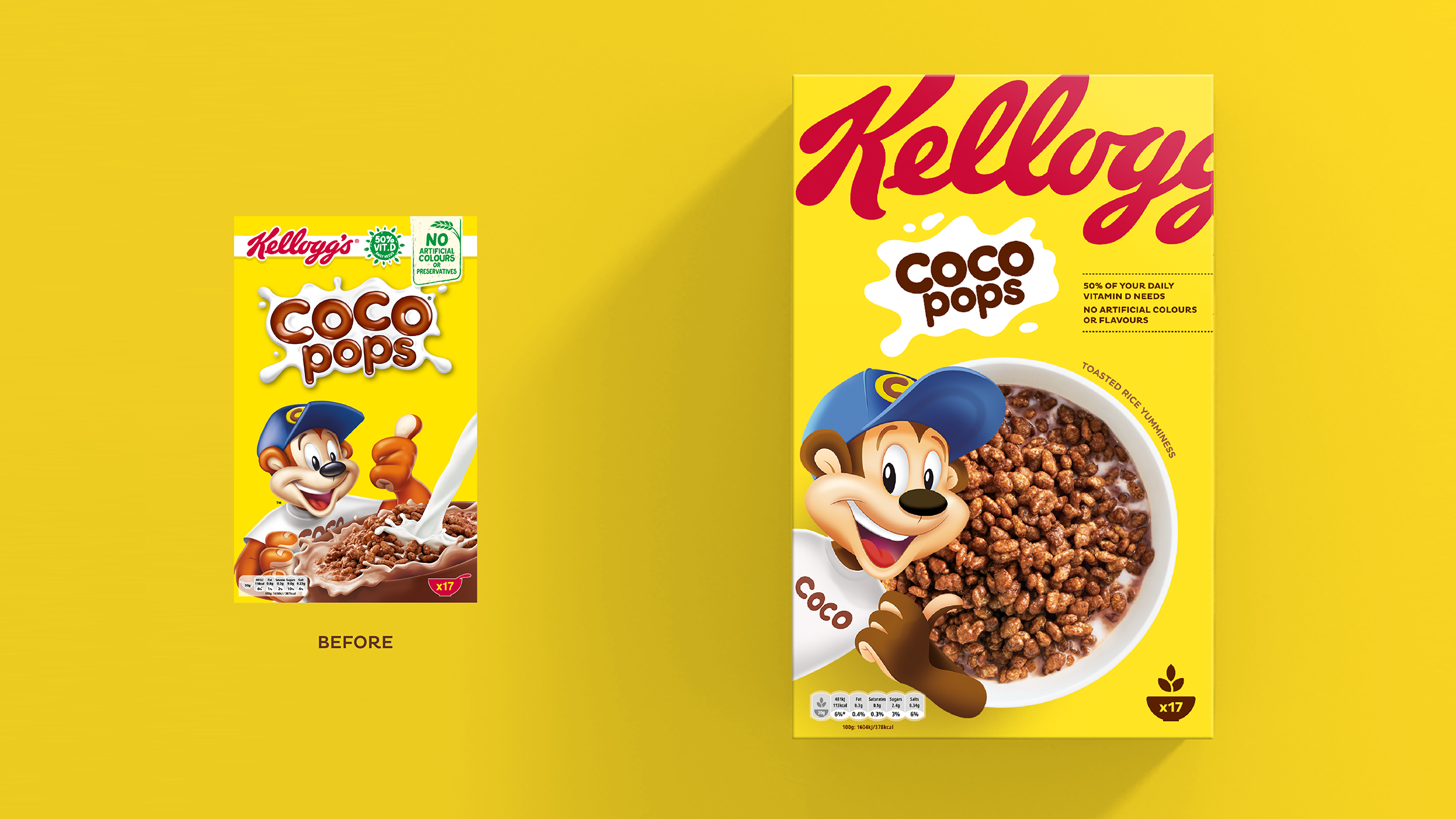
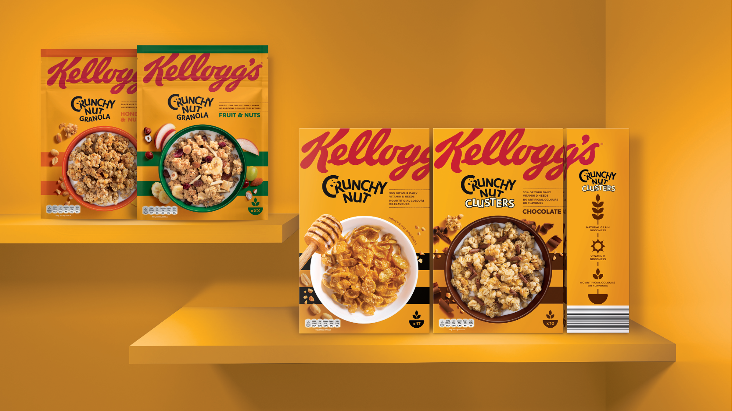
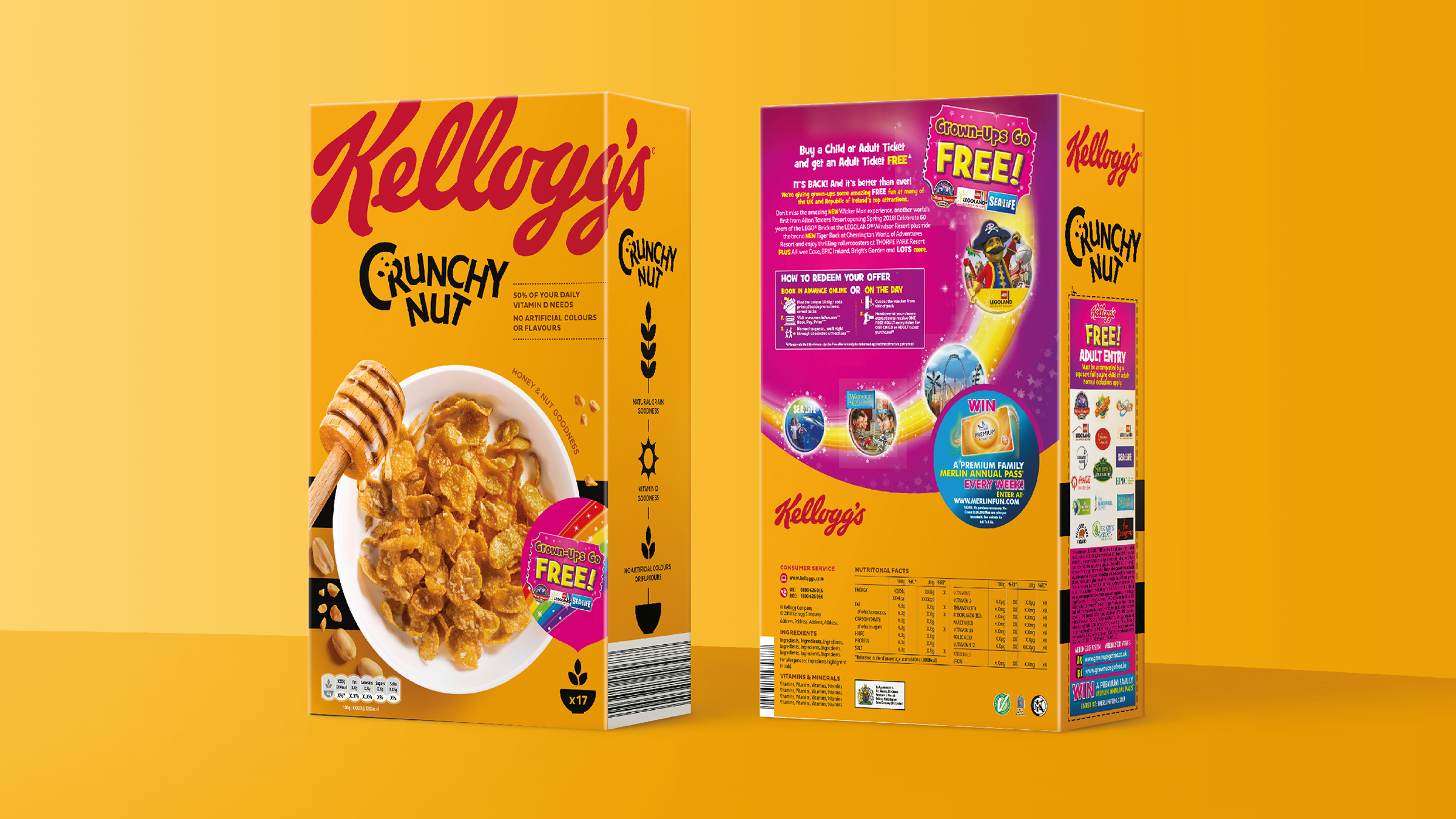
Despite historically being a staple of the kitchen table, increased government and consumer attention around healthy eating meant that Kellogg's needed to improve the natural and health perception of its products and re-establish itself as a category leader. A new strategic approach to design would also help overwhelmed shoppers better navigate an increasingly cluttered category.
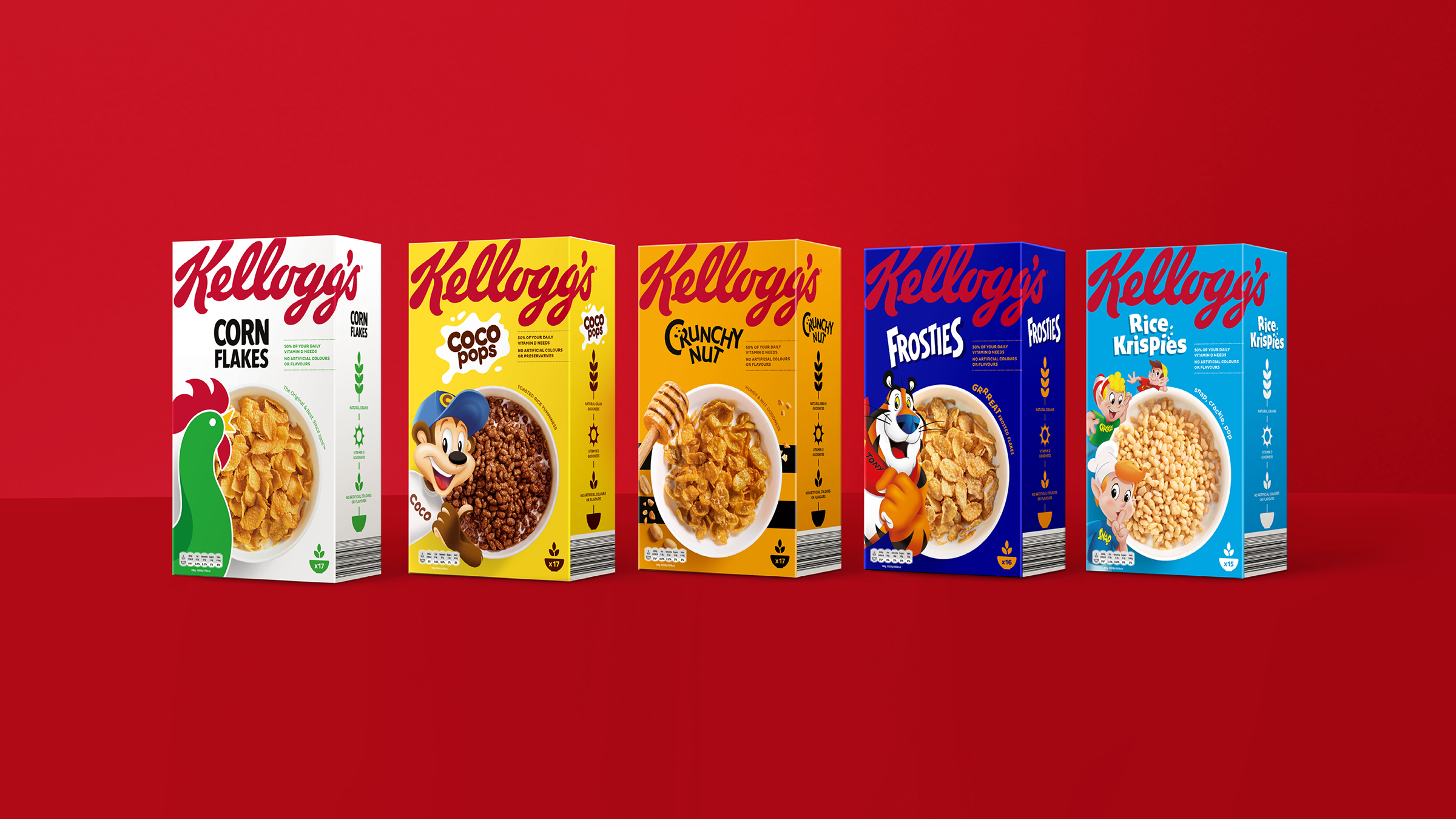
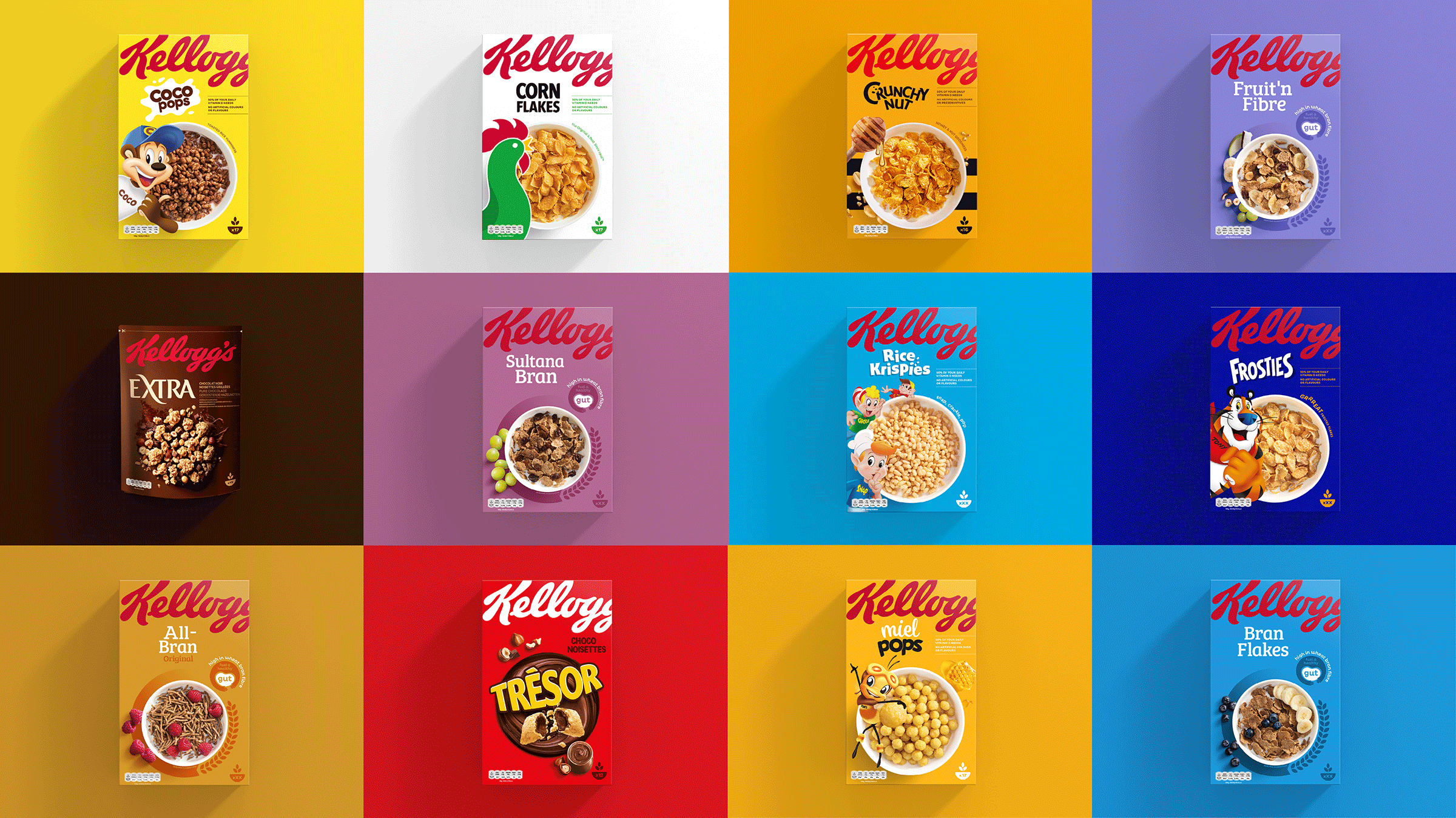
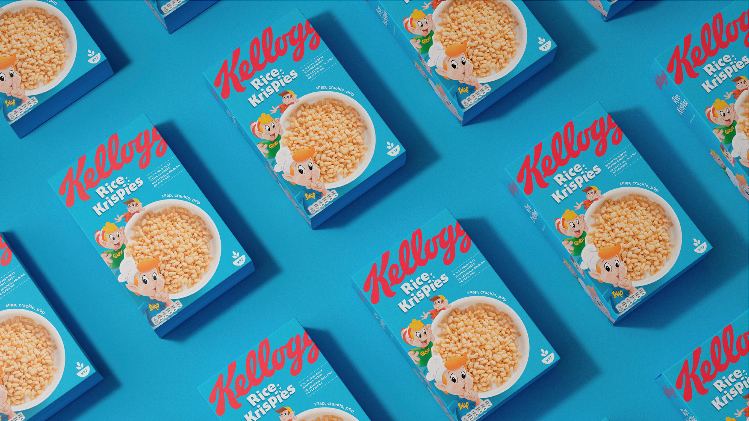
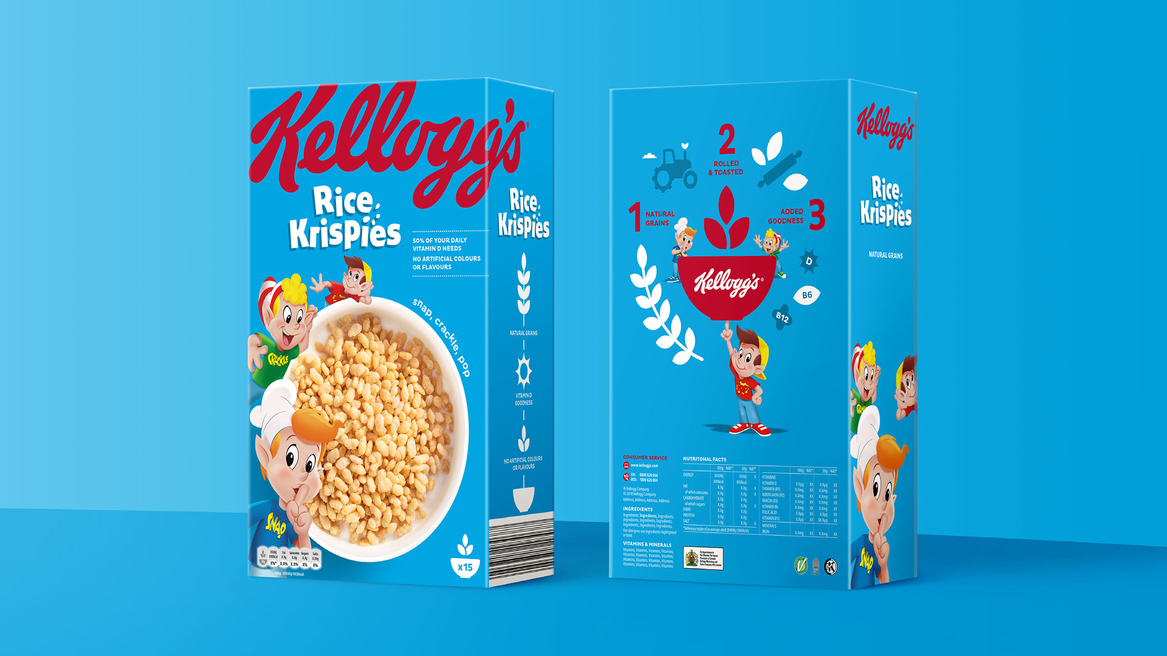
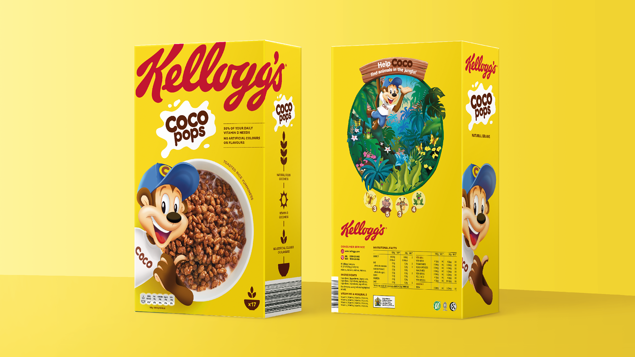
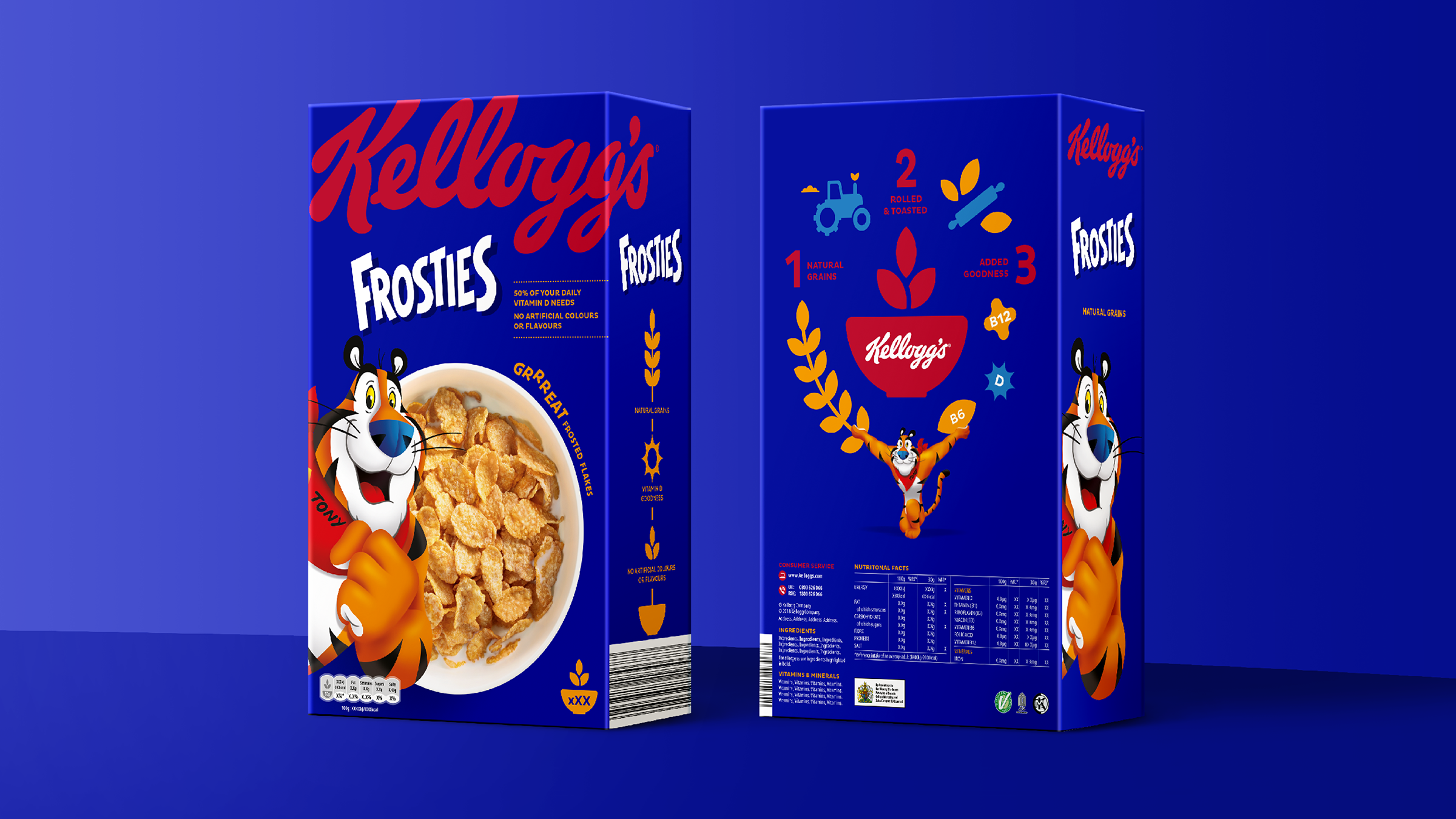
By amplifying the masterbrand, Kellogg's went from a manufacturer in the corner to proudly owning its iconic status. It was also important to unlock the potential of the powerbrands (Coco Pops, Corn Flakes, etc), dialling up their key assets and simplifying consumer navigation. The result was a strong system which allowed for flexibility amongst the different product pillars, and modulation to suit market conditions.
This is the first time in Kellogg's 100+ year history where the portfolio has been considered as a whole; a massive and exciting opportunity. Launched in 2019, the design has been met with overwhelming enthusiasm from internal stakeholders as well as consumers.
The new packs were tested with consumers and revealed:
+ 70% increase in findability on shelf
+ 50% increase in purchase intent


Kellogg’s is one of the world’s most recognisable brands and our cereal boxes are a staple of most people’s breakfast tables. By marrying the best in design with the best cereals, we’re confident our new packs will be a real showstopper on supermarket shelves.
Paul Humphries
Vice President of Marketing, Kellogg’s Europe
Paul Humphries
Vice President of Marketing, Kellogg’s Europe